Harness the power of symbols
The human brain is amazing and still, at this point of history and development of science, very much mysterious. Much more is unknown yet than discovered, but there are some things which scientists and researchers have uncovered and identified.
One of them is some insight into the way we process symbols as opposed to verbal, textual messages. Surprisingly (or not), the research in this field time and time again overturns everything we’ve been taught by our parents and the society.
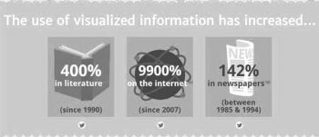
In this post I shall be using the infographics I found researching the subject, at an education blog Mr G Online, and throughout the post you may compare the text with the infographics, to find out for yourself.
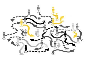
What makes infographics so successful?
The world of literacy and education, as we know it in the last 100 to 200 years, was mainly dominated by the written, and in a lesser extent the spoken, word. Only lately has viewing been introduced into it, but it still doesn’t hold enough of a respected place. It is possible that the reason for this is lack of awareness to the advantages of symbols over the written word.
For example, did you know:
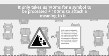
- that we only require 150 milliseconds to process a symbol and 100 milliseconds to attach a meaning to it?
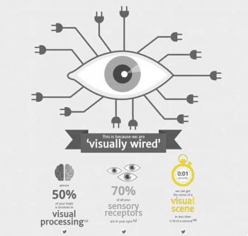
- that we can get a sense of a visual scene in less than one tenth of a second?
- that almost 50% of our brain is involved in visual processing?
- that 70% of our sensory receptors are in our eyes?
- that people remember 80% of what they see and do, 20% of what they read and 10% of what they hear?
And why is that? Because we are visually wired. Which brings us to a simple conclusion: it is easier to receive, process and remember information delivered with the use of symbols and pictures than words. Therefore, we should employ this principle everywhere we need to pass messages, whether routinely or once only. Everywhere we possibly can.
Take a look at little children playing joyfully at the computer. They know not the language, and if they did – it wouldn’t help, as they cannot yet read. And yet, it doesn’t stop them from understanding what they wish: the graphic symbols and use of colors pass the messages to them, which they understand intuitively!
What can we learn from the research?
The research is behind the growing phenomenon of infographics, serves successful website owners.
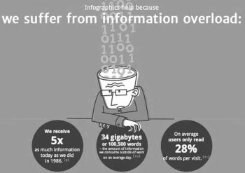
For example: it was discovered, that lately we suffer from information overload. We receive 5 times as much information today as we did in 1986. The amount of information we consume outside of work on an average day is 34 Gigabytes or 100,500 words. Too much information flows to us from every direction, and our brain can handle only so much at a time, and so it filters information out, which is why on average users only read 28% of words per visit.
So why am I telling you all this?
Because the Quality Assurance profession is star producer and processor of… documents. Procedures, directives, work instructions, concessions, specifications, standards, reports, analyses, presentations…
Naturally, all this information is not produced for our private joy and peace of mind. We want to pass the messages to the intended audiences in various situations: management reviews, audits, regular reports, ongoing work investigating non-conformities and so on and so forth. You know, our everyday job. It is, therefore, of the utmost importance the messages are, first, read by and then delivered clearly to same intended audiences, in order to be received and processed in the best possible way.
Visual information is more engaging
Remember Alice in Wonderland? Before embarking on her adventures, she was spending time outdoors with her older sister, who was sitting there quietly, reading a book. Alice had peeped into the book her sister was reading, but it had no pictures nor conversations in it.
“What is the use of a book,” thought Alice, “without pictures or conversations?”
Try reading a book to a child with no pictures. This is why pictures in for young children’s books are central and large, while the words are an addition. My late mother was a professional artist, a boo illustrator. I can tell you stories of the hours I spent perusing her work in curiosity. Take the success of the comics books in past decades, which have even received today a new, more respectable name of graphic novels.
The information is more accessible
Not only does visual representation increase the people’s willingness too read to begin with, but the message conveyed in a graphic way is more to comprehensible and more accessible. This due to all the reasons stated above: receiving, processing and comprehension speed. Thus, the use of the information shall also be better, which is what we are striving to achieve.
- It was discovered that people following directions with text and pictures do better by 323% than people following directions with words only!
- Infographics counter information overload because they are more engaging! Researchers found that color visuals increase the willingness to read by 80%!
How can we use this important information?
How can we pass more information in less words to our intended audiences and ensure optimal receiving of the message?
We can use symbols in a variety of ways. For instance, the first way I proposed for you to use symbols as widely as possible is the use of graphs and charts, and not just the too-familiar Pareto graph and the other, routinely used ones, but a much wider array of graphs. And to make flowcharts and graphic instruction diagrams stand out as the jewels among them all.
Where can one use flowcharts and activity mapping? First of all and above all – to replace the verbal textual instructions in your procedures and work instructions. Forget them, the workers do not read them.
Let’s think together for a moment on the procedures and our willingness to study them.
Verbal procedures
I remember my first day at my first job as QA engineer. My manager has placed two solid-looking ring-folders on my virginally empty desk and said: “These are the company procedures. You are to familiarize yourself with them before you do anything else.”
I recall how sitting there, trying to cram the long texts into my head, pages and pages of beautifully written English texts (and I love reading!), – and I just kept getting lost! Before I got through a few passages I completely forgot what the document was about. The repeats, backups, and loops in logic; the repeating of similar actions in different places; all this created an impossible mess in my head and not only failed to help me to better understand the working of the company, but raised a suspicion in my mind that nobody read them.

A few discrete questions to some high-placed people, or rather their uncertain and somewhat glassy-eyed answers, further convinced me that it was so. People were avoiding reading their own procedures! These ring-folders were good for nothing but show, not used as the tool they were supposed to be: a tool intended to simplify and solve situations of uncertainty, creating harmony in the company organizational processes.
And if myself and people in rather highly placed jobs have had such a reaction, what can we possible expect from many workers, immigrants from different countries, speaking in another language than the one the procedure is written in, who do not understand the written instructions? Many pages of flowing text do not speak to them, only depress them! There is no way the workers would read all this text, especially if they just have a specific question to inquire about, and in order to identify the situations and find the answer they need to read 6 pages of text!
Even then it has come to me quite clearly that I must take it upon myself to change this way of passing out instructions. I needed to get rid of all the superfluous words and turn the procedures into visual aids, in which a child could find the answer he seeks.
Turning procedures into flowcharts
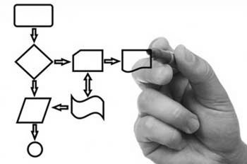
It has taken me between 18 and 24 months to complete the project for all the company procedures, but the result was shortening them most significantly. The content of each procedure was now a flowchart of one or two pages, where one could follow the arrows to find the answer to any question quickly and easily.
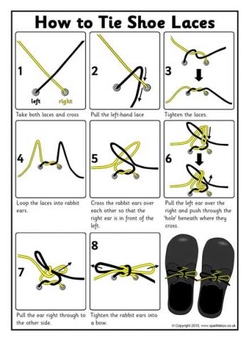
In addition, I have transformed some work instructions into visual diagrams, using graphic symbols. It was not called infographics yet in those days, but that’s what it was. A few easily-recognized symbols with arrows for the order of operations, that’s it.
Verbal procedures
And there is another thing: the new documents were received by the workers like a revelation, an enlightenment. For the first time everything was simple. For the first time those who did not excel in reading could easily find the answers to their questions. Can you imagine what something like this can mean for the workers at your organization? Can you see how it could influence their motivation?
And so I call to you, my colleagues, to adopt the method and go from texts to a wide array of graphic symbols, colors and flow charts. And don’t you limit yourselves with the accepted meaning of flow chart elements as known in electronics, either. Use them to the best of your own understanding, play with them, be flexible, light and creative. Choose the elements intuitively, not based on some general knowledge, for intuition will resonate in others, but general knowledge is often, paradoxically, not common to all.
Have fun with this project, turn it into a game, enjoy it. After all, this is your opportunity to get creative at your workplace!
Because, as they say, one picture is better than two birds in a tree… or something like that… 🙂
Bottom picture: graphic instructions how to tie shoelaces. Downloaded from the SparkleBox website.
This post is available also in:
 עברית
עברית
You may also find interesting:
Powered by Contextual Related Posts


